
Even though your photo may be properly exposed, if it is not pleasing to the eye, nobody will be interested in looking at it. Even non photographers know what looks good in a photo. Some people no matter how hard they try just can’t produce appealing photos. Though occasionally they do get lucky once in a while. While you can learn all the rules and techniques of composition, you either have the knack or you don’t.
Remember photographic rules were meant to be broken. If you are a slave to the rules, your photos will end up all looking the same. One rule that even the least experienced photographer knows is the rule of thirds. While following this rule will provide a pleasing photo, being a strict follower of it will produce photos that all look alike. The same thing happens when taking landscape photos only with wide angle lenses. Try mixing it up and use telephoto lenses to isolate a particularly interesting feature of the landscape.
What is photo composition?
Photo composition is how a photographer arranges visual elements within their frame. “It’s a pleasing organization of objects within your rectangle,” says photographer Adam Long. Putting subjects or scenes inside that space may sound easy, yet it’s anything but. Composition in your shots can often be difficult and it’s always important. “Everything can seem perfect: lighting, location, wardrobe, styling, whatever,” says photographer Grace Rivera. “But if your composition is off, that’s a deal breaker.”
Rules of composition.
Composing a good photo goes beyond just focusing on your main subject. These are some of the most common compositional techniques for photographers who want to create a visually interesting shot.


Use the rule of thirds.
The rule of thirds is a way of dividing frames for optimal composition. It involves evenly dividing the frame between two equally spaced horizontal and vertical gridlines, creating a three-by-three grid. In order to create balance and flow within the image, compositional elements should be placed where these lines of the grid intersect or segment your image. This tends to allow for more interesting images than simply centering a subject. “You want to move your eye around that image and find things with that trio,” says Long. A photo with an interesting element in only one section likely won’t be as successful as a photo that’s interesting top-to-bottom and side-to-side.
Balance images.
Balance is related to, but distinct from, symmetry. A balanced image doesn’t necessarily look the same right-to-left or side-to-side. Rather, the various quadrants of the image complement each other in aesthetically pleasing ways. A viewer’s eye will likely scan the picture, looking for a point of interest and something else in dialogue with that point — an obvious subject might be balanced on the other side of the image by negative space. “If you have a really complicated photo with a lot of stuff going on, it can cause us to respond by drawing parallels,” says Long, “which can be kind of invigorating, confusing, and aggravating in a good way.”

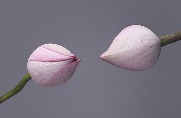
Loud or vivid colors often demand attention and disrupt or complicate. “The saturation of certain hues is really going to pull your eye,” says Long. “If I want something to pull more visual weight, increasing its saturation or its luminance can be useful.”
Unbalanced photos can look disorienting or amateurish. “When a photograph is out of balance it provides uneasiness,” says Long. “The majority of the time we like a sense of fluidity with the image.” Things on the left correspond with things on the right, and perhaps they circle around something in the middle. Like having a feel for aesthetics or good intuition about images, recognizing balance comes with practice. “Balance isn’t something you can teach people,” says Long. “You really get a sense of it as you look at things.” The more you work, the more familiar you get with how elements of an image work in concert with each other.
Work with leading lines, focus, and depth of field.
Photography flattens three dimensions into two. In order to preserve a feeling of space and dimensionality, a photographer has to be aware of what’s in a shot and how they’re focusing on it.
Leading lines are visual elements that pull the viewer’s eye toward a subject or focal point. They can be anything — roads running off into the distance, an arm stretched out toward something else, tree branches rising toward the moon — anything that pulls attention toward something else. These lines can give flat surfaces the appearance of depth, dimension, and shape.
Focus and depth of field also add to the illusion of a third dimension within the photo. Shallow depth of field can give the viewer the impression that they’re focused on something immediately in front of them, and it provides a look of depth and scale, even in a flat photo.
Find the right point of view.
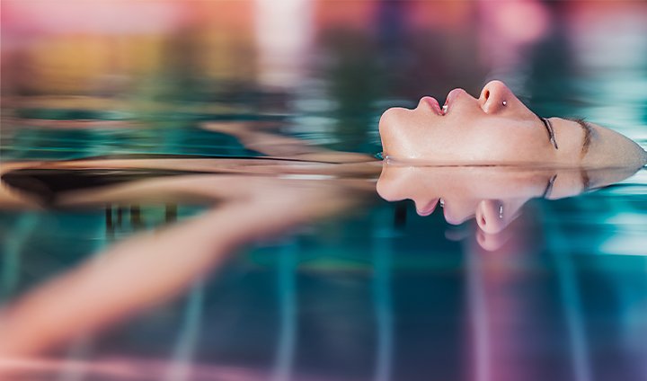
If you want to play with composition, move around. Simply changing perspective can mean the difference between a great photo and a conventional one. ”All we’re doing is choosing to exclude things or include things,” says Long.
Play with your spacing and distance from your subject. “I move around a lot,” says Rivera. “I get really low or really high. I see what it’s like if I get under my subject or see what it’s like if they move side-to-side.” Get close, get far, and move to find how you want to frame your subject.
Lastly, when you’re composing a shot, keep in mind how the image is ultimately going to be used. “There might be text that goes over an image, or it might be a magazine cover,” says Rivera. Allow for those potential extra elements when you’re lining up the shot, and try to conceptualize them while you look through your viewfinder.
Improve composition with post-production cropping.
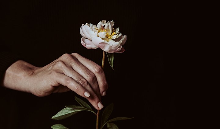
If the composition of a photo is a little off, it’s often possible to improve it in post-production with a quick crop. A photo might not frame the subject in an optimal way. But, just by moving the edge of the frame, you can often find a good image within a mediocre one.
When going through old images, try looking at them from a different angle or perspective. “Play with the rotation of the image,” says Rivera. “When you do a crop you can rotate it, flip the image, or put it upside down and maybe see something else.”
Getting composition right.
You need to do more than just follow compositional rules to shoot good photos. It’s possible to follow things like the rule of thirds without intention or to use it without purpose. Understand that the elements of composition aren’t like algorithms or formulas — they help guide a photographer’s decision-making skills, not substitute for them. “Leading lines are great, but hopefully they’re leading me to your subject and not leading me to nowhere,” says Long.
Photography composition rules are the foundation. After you’ve internalized the fundamentals of what goes into a good image, you can break the rules. “Once you have the basics down, you can experiment,” says Rivera. “There are no set rules for how you should shoot anything. That’s the beauty of being an artist. You can make your own rules and your own imagery.”
Good photographers have an eye for subjects and scenes. Composition is a tool they can use to help others see what they see. They collect elements of a wide world and, with their equipment and expertise, organize it pleasingly within a rectangle. This is true for any type of photography, whether it’s portrait photography at a human scale, landscape photography on a grand scale, or macro photography of tiny worlds.
7 Tips For Choosing and Emphasizing a Subject
When it comes to photography subjects, the possibilities are endless — here are seven tips to help narrow down your choices to choose and emphasize the star of your photograph.
Placement is key.

Where is the subject in your photograph? Centered? Off to one side? Choosing where to place your subject in the frame can help your subject demand even more attention. Centering the subject emphasizes symmetry and pattern, while using the rule of thirds and placing the subject off to one side tends to draw the eye. For moving subjects, try leaving extra space in the frame in the direction it’s headed in.
Perspective plays a big role in how we see a subject.
Imagine the shape of a simple chair viewed from the front — turn it to the side, or even view it from above and the entire shape of the chair changes. The angle that you choose to shoot the subject from plays a role in how it’s perceived. Try experimenting with different angles and watch how the subject’s shape changes. Even the size of the object may appear to change — objects close to the camera’s lens look the largest, while shooting down on a subject tends to make it look small.
Look for light.
Angles come into play in more than just the shape of the subject — what angle is the light coming in at? Light can play a dramatic role in the way your subject looks. When leaves and flowers are backlit, for example, they appear to glow. Backlighting also makes it possible to emphasize shape by creating a silhouette. Lighting from the front tends to reveal all the details, while side lighting emphasizes shadows. Lighting with dark shadows creates a lot of contrast and a sense of drama, while lighter shadows create a softer, more elegant look.
Practice developing an eye for interesting subjects.
The more you shoot a variety of subjects, the more you’ll get a feel for what would make a great subject. Experienced photographers will often spot great lighting, an interesting pattern or an odd placement and immediately know that’s their subject. That comes with practice. Try a 365 photography challenge, start bringing your camera with you everywhere or take a weekly photo walk.
Practice portraying ordinary objects in unusual ways.
Boring subjects sometimes make great photos because it’s not necessarily about the subject, but the way that it is presented. Choosing the shooting angle, the lighting, the composition — all that combines to create either an ordinary or unusual presentation. Practice finding unusual ways to shoot everyday subjects — find the must ordinary object in your kitchen or bathroom and shoot it in a new way.
Tell a story.

People look at a piece of art, and they see a story. The human mind is always trying to fill in blanks — so work to give them some clues and telling a story within your photograph. Is the setting important to the story? Try taking a few steps back to show more of it. Setting not so essential? Try getting in close for an intimate look at your subject. When photographing people, look for emotion and action that helps to create a story in the viewer’s mind.
Surroundings matter.
The subject is important — but so is everything else in the frame. The background and foreground help to tell that story. Is the object where you’d expect to find it, or in an usual place? Is it by itself, or does it stand out among clutter? Consider everything in your photograph and if it doesn’t have a reason to be there, consider moving in closer or adjusting your angle to eliminate any distractions.
Find what inspires you.

Often, the answer as to why the photographer decided to shoot that particular subject is simply that they were inspired. Photography is a way to show how you view the world — people and objects that matter to you always make a great subject. Some photographers love shooting classic cars, others birds. Find what inspires you, and then you’ve found your photography subject.
The subject is the essence of a photograph. Sure, there are many other elements to taking a photo, but having a great subject — or a boring subject presented in an unusual way — is essential to crafting great images.
Composition: Ansel Adams Visualization Theory & Techniques
Photography is a creative medium. There are often more moving parts then one would like to acknowledge and with so much going on it can sometimes be hard to remember the fundamentals.
One fundamental that’s not often talked about is the “Art of Visualization”… A concept that originated from well-known landscape photographer Ansel Adams.
The idea behind this concept was to visualize in your minds eye the end result that you were trying to achieve prior to actually taking the photograph.
Whilst this may sound old fashion, especially with the introduction and mass distribution of digital cameras, but the fact is that couldn’t be further from the truth.
Before I take any photographs there is always one question that I ask of myself and that is… Where Do I Want The Viewers Eye To Be Lead Within My Photographs?
This is an important question and one that you should consider at the time of exposure.
From a young age we are taught to read left to right which comes across as being quite natural. But when viewing images the eye performs in an entirely different manner depending on the colors, densities, perspective, subject matter and even the format… all impact how you consume a photograph with your eyes.
Next time your out and about with your camera, before you press the shutter, give previsualization a whirl, you might just be surprised with the results.
Photography is an artistic and technical profession that involves visual design and strategic analysis to create a well-composed photograph that attracts audiences and conveys its intended message. Other professionals can apply photography skills and knowledge in their work for marketing, real estate or communications industries. Understanding photography composition rules can help you develop your skill set as a photographer or enhance your performance in another profession.
What are composition rules in photography?
Composition rules in photography are aesthetic principles that guide the elements that a photographer considers and incorporates when taking or editing a picture to produce an interesting visual arrangement for viewers. These rules involve structural aspects, such as proportion, patterns and framing, along with artistic theories with colors and contrast.
Human habits and interactions guide the way viewers look at an image and determine their attraction to its composition and the message they perceive from it. A successfully composed photograph leads viewers to the intended subject or focus captured.
17 composition rules in photography
Here are some of the specific photography composition rules to guide you:
1. Color theory
Color theory revolves around the color wheel and its segments, with contrasting, complementary and analogous palettes with shade or tint variations and tones. The color wheel features the colors of a rainbow that demonstrate primary, secondary and tertiary relationships to guide compositional color placements. Using color theory, photographers might arrange colorful items in an image to achieve a bold or muted palette.
2. Depth
Photographers can achieve image depth by adjusting the focus of their camera lens or capturing layers within their composition. Contrasting layers between the foreground and background of an image create a perception of depth that separates the subject from the rest of the composition and can guide a viewer’s eye deeper into a photograph. Adjust the aperture of a camera to focus on the intended subject.
Every shot has a foreground, midground, and background. What you choose to show (or not show) tells a lot about what’s in your shot.
Sometimes, you’ll want nothing at all in the frame except for your character. But most of the time, you’re going to want to establish your character in the world you’ve created. You’ll want to show how your subject relates to this world, including what’s out of focus.
The depth of your scene is affected by:
Location: where you shoot.
Lens: what lens you use and it’s capacity to provide depth.
Your lens choice is critical and determines your depth of field. A wide-angle lens will have more space in focus, which will make it more difficult to focus on your subject by blurring out the background. The distance between the subject and the background will also be exaggerated in how far away it looks.
A lens with a longer focal length will make it easier to achieve a shallow depth of field (even if you use the same F-stop). Essentially, it will allow your subject to stand out more from the background. It also makes background objects appear closer than they would with a wide-angle lens.
Your choices here will help your audience determine what they focus on, what they find important in the scene, and how your character relates to the world around them.
3. Diagonal lines
Diagonal lines add perceived movement to a composition, along with providing a sense of depth. These lines can lead viewers to follow the direction of the lines to the main subject of an image. Incorporating diagonal lines allows photographers to demonstrate dynamic aspects in a still photograph.
4. Edges
The edges of a photograph are important to consider for the framing of an image and the focus of the photograph. Having objects or other features in the edges of a composition may obstruct from the main subject or produce a cluttered effect. Remove or crop out these features to ensure a clear focus in an image.
5. Frame fill
Frame filling involves cropping an image to retain only the subject of an image. Photographers fill their frames for portraits and other photographs that focus only on a single subject. To fill a frame, photographers can zoom into their subject when taking a picture or crop the image during the editing process.
The size equals power rule sounds simple, but it has huge implications for your project. If an object takes up a large amount of the frame, viewers will see it as important. If it only takes up a small amount, then it’s insignificant in the bigger picture.
The rule applies to inanimate objects as well as characters. Framing also comes into play here — for example, if you choose a wide-angle shot of someone standing in an open space, it can give the feeling that they’re somewhat insignificant. The same shot closer up can imply a sense of control.
Camera angles also play a big role. Viewing your subject from below can create a feeling that they are dominant, as the audience (and the characters are literally are looking up to them). The opposite is true, too. A view of the subject from above causes us to feel that they are weaker or smaller subconsciously.
6. Frame within a frame
A frame within a frame can include natural or constructed framing pieces such as tree branches, hedges, bridges, archways, doorways and other structures that create a frame effect. These frames may frame a subject in an image or be the main subject itself. Consider potential frames in an environment to use when taking photographs.
7. Horizon line
Horizon lines naturally occur in different environments with floors, ceilings and other flat left-to-right lines. Photographs with sunsets, skylines and other landscapes feature horizon lines that separate the ground and the sky. The placement of a horizon line may be in the middle or a third of an image.
8. Leading lines
Leading lines include all the lines within a composition to create a sense of movement. Using different types of lines, such as vertical, horizontal and diagonal lines, leads viewers to a focal point in an image. The more dominant or abundant type of line in a composition provides the main direction for viewers to follow.
Visible lines in your shot will subconsciously tell your viewer where they should be looking. Lines are everywhere: the stair railing, the picket fence, a river running past, roads, railways, and so on. It’s a subtle way of guiding your audience in the direction you want while also adding an element of depth to your footage.
It’s worth scoping out locations where you may be able to use leading lines in your shots, such as in the example above. Once you start looking, you’ll be surprised at how easily you find them!
9. Negative space
The negative space of an image can provide balance and a sense of weight, depending on the depth and shade of the negative space. Photographers may incorporate a large proportion of white or black negative space to achieve different effects and significant contrasts. Commercial photography purposes may also involve negative space to provide an area for marketing texts or other promotional content.
10. Perspective
Perspective involves different types of viewpoints, from bird’s-eye views to worm’s-eye views, which affect the proportion and depth of a composition. Changing the perspective of a subject alters the direction of leading lines to create varying ranges of movement. When taking photographs of a subject, consider different angles to capture and determine the most dynamic or appealing perspective.
11. Repetition
Repetition in a composition creates patterns that can produce movement or depth. Photographs with a repetitive subject can include products on a shelf or other displays. A photographer may feature repetitive foregrounds or backgrounds with wave patterns or cars.
12. Rule of odds
The rule of odds suggests that eyes gravitate to the center point of a group, which requires a group with an odd number of items or people. Featuring two items or an even number of things in an image may lead viewers to look at an empty space in the middle. Having an odd number of items ensures that viewers look at the intended subject rather than the background.
13. Rule of thirds
The rule of thirds divides an image into nine segments using three vertical and three horizontal lines to divide the parts of a composition. The four intersecting points of the rule of thirds grid are the focal points of an image. Enable the grid lines on a camera or in editing software to achieve use of the rule of thirds. There are many theories about why the rule of thirds works. One reason is that a shot can have so many competing points of interest, and adding points of interest on the thirds will help eliminate any unnecessary distractions. It also helps position the shot in a way that shows what the character is thinking and feeling. Overall, it provides an intuitive feeling of balance and context that’s helpful for your viewer.
14. Symmetry
Symmetry occurs in natural or constructed environments that can create balance in an image that also frames the main subject. Incorporating symmetry can create a pleasing effect, while breaking symmetry can produce a dramatic effect. Consider the symmetry in object sizes, textures or numbers to compose your photograph.
Alternatively from using thirds, the next composition rule is to create symmetry. For some reason, human brains respond well to symmetry. It simply looks and feels good, and once again, creates a sense of harmony and balance.
Using symmetry is a great way to get your point across in these scenarios:
-To convey the beauty of a scene.
-To help your audience focus on your subject.
In fact, symmetry is the one time when breaking the rule of thirds works. If you want your subject to stand out, you can put them dead center in the frame. Symmetry is often used in moments when a character is experiencing a powerful moment. It draws the viewer’s attention to them in a unique way.
But do use it sparingly. It’s definitely best kept for a handful of poignant moments. You run the risk of giving your audience conflicting messages if it’s overused.
15. Triangles
Triangles are another example of odds and thirds with their three points or intersections which produce leading lines and a dynamic balance. When evaluating the leading lines in a composition, consider how to achieve a triangle shape or effect. Images can have multiple triangle outlines using diagonal lines to map out the movement of a photograph focus.
16. Leading and Head Room
Typically, this rule is used in combination with the rule of thirds. Basically, head room means that you want the top of your character’s head to be in the frame at all times. If your subject’s head is cut off, it creates a feeling of being cramped and uncomfortable, as well as just looking a bit bizarre.
When you want to break this rule, though, is during a close-up and you want to focus on your subject’s eyes. This is impossible to do while still keeping their head entirely in the frame and sticking to your rule of thirds at the same time.
Leading room refers to the amount of space next to your character while they’re looking in a particular direction. If your character is facing the left-hand side of the screen, you’ll want them to be more on the right-hand side, to provide space between them and where they’re looking.
If they’re too close to where they’re looking, it may come across as though they’re looking off the screen, which creates confusion in the minds of your viewers. More space in front of your character also helps the viewer to put the world in context better, and understand where the subject is and what’s happening around them.
17. Break the Rules
We all love being given permission to break the rules! While these six rules are essential when it comes to composing a pleasing image in your viewfinder, you don’t need to stick to them religiously. Get creative!
Remember, it’s all about getting your message across. If the rule of thirds moves the story forward, then awesome! That said, there may be an instance where doing something completely opposite to the composition rules would be the best course of action to convey your point.
Don’t be afraid to do something different. If you aren’t sure if something would work, try shooting the same scene in a few different ways. Your test shots will give you a better understanding of what works best for your film. And of course, have fun with it!
Additional Tips For Good Composition
The 180 Degree Rule

As a viewer of a film or video, we feel like we are watching the action. In doing so, the camera will sometimes cut to a closeup of one subject matter, then another, like two people talking for instance. It may then cut to a wide shot where we see body language and more surrounding objects. You can imagine a line running across the scene through the subject matter.
This imaginary line represents the 180 degrees that the camera views in the scene. Once it has been established, that the viewer is looking on from one side, it’s poor composition to jump to the other side of the room. Doing so will make the subject matter appear to jump across from each other and be looking in the wrong direction.
The effect of breaking the 180-degree rule can be used if the goal is to be jarring, but in order to maintain a sense of order, it’s best to stay on one side of the action as if the camera was the viewer looking on.
Up/Down Angles

Many times, you want to shoot your subject matter at eye level to give the viewer a sense of being a part of the scene. But you can also achieve dramatic effects by shooting at up and down angles towards your subject matter.
Shooting a down angle from above the subject gives the viewer a sense of power over the subject. It makes the subject appear weaker and smaller in stature. It can also be used in a more positive light to make the subject appear more docile or friendly.
While shooting the subject from a low up angle gives the power to the subject. It makes the subject seem larger or looming. It can be imposing and threatening. It can also be looked at as something to reach for or achieve, like a shot looking up at a mountain peak.
The use of up and down angles can be quite dramatic in frame composition, or it can be subtly used to make a character seem slightly taller or shorter just to enhance your story.
Find ways to incorporate these angles to help subconsciously inform your viewer what to feel about the subject matter.
The more you follow and break these rules, the better a filmmaker you’ll be. You’ll understand how your composition can result in specific outcomes, looks, atmospheres, and feelings.
At the end of the day, people don’t walk away from your video thinking about individual shots. They’ll walk away with thoughts, feelings, and emotions, and you get to lead them along the journey. The seven rules for better shot composition is just the starting point. So, get out there and start experimenting. You’ll quickly see how your productions will improve!
Resources
shutterbuggs.com, “Composition: Ansel Adams Visualization Theory & Techniques.” By Annabella Dean; indeed.com, “15 Photography Composition Rules To Improve Your Skills.” By Indeed Editorial Staff; creativelive.com, “What’s in a Subject? The Beginner’s Guide to Choosing a Photography Subject.”; adobe.com, “The basics of photography composition.” By Adam Long and Grace Rivera; motionarray.com, “7 Rules For Better Shot Composition and Framing.”;

